Wednesday, April 9, 2014

Photoshop Artist Research

 I have been tasked with researching artists who use photoshop. I didn't have to look too terribly hard because as it turns out, I've been doing "artist research" on deviantart.com since the internet was invented! Deviant Art has been a huge source of inspiration for me since I was but a wee lad. Just seeing all the different artists and the things they were doing always drove me to want to be able to do what they were doing with my own work. Photoshop has always seemed so inaccessible to me because the interface is a tad bit intimidating and there's so much you can do with it that I didn't even know where to start! As for Illustrator, I didn't even know such  dream existed! So, here goes. These are some of the photoshop artists I've been following since the dawn of the interwebs...

Kandoken 

Gallery Link


Kandoken has been a huge inspiration to me because of his vivid use of color and his strong line work. Also, a lot of his material is video game/cartoon/comic-related

CHAMBA


Chamba has always been a big influence on me because of his crazy foreshortening (not really evidenced much here) and his crazy ability to use color (and photoshop!) so well. Also, he does video game fan art. That's pretty much a pre-requisite for this list…

Darren Geers


This is an artist that I've only recently discovered but his skill and efficiency in photoshop are just as admirable as those who came before him. Also, video games…

Kizer


Kizer layers his colors and values in a very loose but cohesive way. He has a very concise painterly technique that adds a certain energy to his art that is difficult to attain without getting to messy. In some ways his work is more of the same stuff (comics/cartoons/video games) done in his own style. 

Junon


This guy's pretty good even though he's also relatively new to the scene so-to-speak. I particularly enjoy his ability to depict believably immersive environments as well as his playful use of color. 

Tuesday, April 1, 2014

FONT-TASTIC INFOGRAPHICS

Why, hello there!! Where in the dickens are my manners? Allow me to introduce you to my friends font and typography. Typography is basically the arrangement of letters on a page (duh, ya big dummy!) and font is the way or style the letters are written in. Today we will be studying infographics, visual images such as charts or diagrams used to represent information or data, and how they are successfully organized and arranged in order to best convey whatever message we need to get across to our reader while still maintaining legibility.

Example 1

Here we have a very simple, efficient infographic which gives you the basic idea of what an infographic is and how it works. Basically it's a combination pictures and type which convey whatever information.


Example 2
In this example, we see a lot more information being crammed into one area. Some portions of its composition are effective while it seems to get a bit jumbled and busy at the same time. The breakup of the different bodies of text helps the viewer's eye to divide the text into separate groups of information. The pictures relate to the bodies of text that they are placed next to and the words they're relating to are often large and exaggerated in order for the viewer to better identify and separate the information.


Example 3

This example is better organized and is connected by one big illustration to cohesively unify all of the text into the infographic's main idea instead of a bunch of different images relating to each body of text.


Example 4

In this hilariously entertaining example we have a game review (of a game that you play through and win by only pressing the space bar) that has moving text that illustrates the words being spoken. The text is very well-organized and is presented in a way that is both entertaining and clear.


Example 5


Here is a compilation of examples of animated infographics that are effective in delivering their respective messages and also maintain and hold the viewer's attention.


Okokokokok, so I won't say much more on the matter because just typing about all this type is typically  mind-numbing, especially to those who have to read it all: @_____@  <----type face (OOOOOOooooohhhh….!) But, you get the general idea; Be entertaining. Keep your text organized and be clear about your message. kthxbai

Wednesday, March 5, 2014

OMFFFFFFFFFFFFG PAPERCRAFT!!! :3

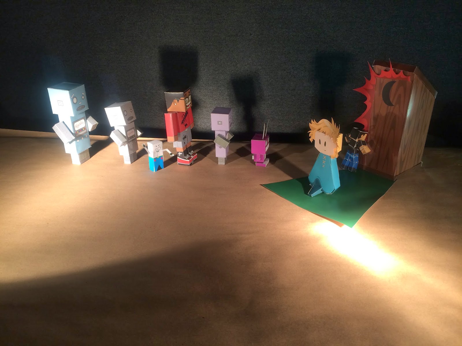
Okay so now is the time to make the paper crafts. This project involved much design savvy and creativity. I researched many paper craft models on the interwebnets an it was made abundantly clear that my brain and fingers would be sobbing together in unison from the pain this project would cause. After scouring the internets into the wee hours of the night, which  included mild amounts of origami research, and folding up other designs the good people of the internets have made, I decided to come up with my own design created from many parts to create one big body:
lollolololololol j-play but yah like this.
(image courtesy of :housevifalcon)
Colours were composed of whatever I was wearing at the time so just blue (jeans), black (clothes and hair), and tan for skin tones. I tried to piece together a decent model but my original design was way too complicated for me to be able to figure out before the final draft of the project was due so I decided to take a more simplistic route and design a figure composed of cubes.


I plan on adding more accessories and more features such as a jacket and some added shapes for the hair to complete this model. The final pieced-together design had its flaws and needed to be tweaked a little. I need to account for space between the legs as they seemed to obstruct one another and I need to change the shape of the torso so it's got more definition. As for construction, pretty much all I did was cut out the shapes, shoved toothpicks through the designated "hole circle" and glued the arms to the torso. The toothpicks hold everything together and need to fit snugly in their respective joint holes in order for the model to hold together so I had to be careful not to make the holes too big before sticking the toothpicks through.

PICTURE TIME!!!


kdone

(MOAR) GESTALTS!!!! O___O!!

SO, I am to make a better (Read: Finished) GESTALT COMPOSITION. ONOES!!!1 I BARELY MAKE IT THROUGH FIRST GESTALTS D:
Ok, so I do more to it for to finish it this time but I wish I could do even more. I maked background junk from random shapes filled up with ugly camouflage colours and finished up on the kids in the jacket. Here is teh finish product of what I do second time around this time with more betterness but still not much goodness though unfortunately…...

I wanna throw in childrens around the man in the camo in silhouettes to more elaborately and clearly display the figure and to give the viewer's eye a place to rest and draw them in to see the details within his jacket.

Tuesday, January 28, 2014

M.C. Escher Gestalts All The Time

This guy who name MC Escher make gestalt principal's art.
See, watch
Yeah that's right he done those and also so much many more too as well


It's so like he make even negative space be more like things instead.
That's Gestalt.

Thursday, January 23, 2014

THIS IS A POST

              [____]
               |___|
                |    |
                |    |
                |    |
                |    |              
                |    |              
                |    |
                |    |
                |    |
                |    |
                |    |
                |    |
                |    |
                |    |
                |    |
                |    |
                |__|
             |_____|
            [______]
            Test Post


Project 1: Self-Portrait……..USING ONLY RECTANGLES (in Adobe Illustrator) *DUNDUNDUN*

My process for assignment am be that to make pretty face from the rectangle tool within adobe illustrator. Success was made. Mostly I use rectangles and bunch em all up in lil bitty blotchy patches of color. I layer with that some photo referentials underneath for the easy making of face building process, y'know? Colors were mostly like, skin-color and green rectangles and black rectangles. HERE SEE!?:

Then I maked  a pattern from layered opaque rectangles just real fast for a background. Then a body appears underneath my head and my project finishes:


Basically, it came out reely gewd but I wanna make it smoother and give it more swag like whoa. Only then perfection I can haz.