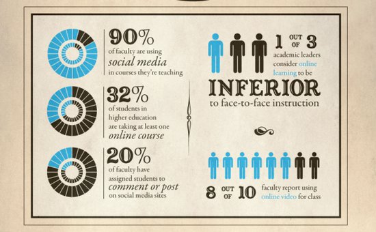
Example 1
Here we have a very simple, efficient infographic which gives you the basic idea of what an infographic is and how it works. Basically it's a combination pictures and type which convey whatever information.
Example 2
In this example, we see a lot more information being crammed into one area. Some portions of its composition are effective while it seems to get a bit jumbled and busy at the same time. The breakup of the different bodies of text helps the viewer's eye to divide the text into separate groups of information. The pictures relate to the bodies of text that they are placed next to and the words they're relating to are often large and exaggerated in order for the viewer to better identify and separate the information.
Example 3
This example is better organized and is connected by one big illustration to cohesively unify all of the text into the infographic's main idea instead of a bunch of different images relating to each body of text.
Example 4
In this hilariously entertaining example we have a game review (of a game that you play through and win by only pressing the space bar) that has moving text that illustrates the words being spoken. The text is very well-organized and is presented in a way that is both entertaining and clear.
Example 5
Here is a compilation of examples of animated infographics that are effective in delivering their respective messages and also maintain and hold the viewer's attention.
Okokokokok, so I won't say much more on the matter because just typing about all this type is typically mind-numbing, especially to those who have to read it all: @_____@ <----type face (OOOOOOooooohhhh….!) But, you get the general idea; Be entertaining. Keep your text organized and be clear about your message. kthxbai


No comments:
Post a Comment